Welcome to my first CSS’s article, I propose to talk about clip-path property. This will allow you to do a multitude of things that we will see here.
It’s something that enables to you a lot of things we are going to see here.
Quick presentation
The clip-path property makes it possible to you to do any fancy shape you have in mind and extract it from image, div, …
The content inside the clip-path will be shown, while those outside will be hidden.
When you are clipping an element, only the visible part will trigger events (click, hover, …) which is really cool.
For example, it’s possible to do some avatar:

#avatar {
  clip-path: circle(50%);
}

#star {
  width: 100px;
  height: 100px;
  background-color: red;
  clip-path: polygon(
    50% 0%,
    61% 35%,
    98% 35%,
    68% 57%,
    79% 91%,
    50% 70%,
    21% 91%,
    32% 57%,
    2% 35%,
    39% 35%
  );
}
How to make shapes?
You may have seen in my previous examples two ways to do make some shape. Before seeing each way to do that, let’s see the coordinate system.
Coordinate system
An image is better than words:
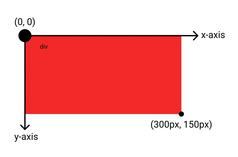
As you can see the origin is in the top-left corner of the element, the x-axis going right and the y-axis going down.
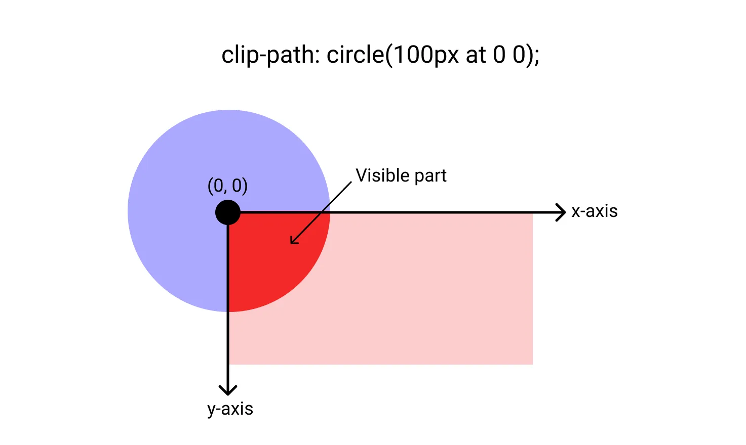
circle()
One of the possible value to clip-path is circle(). You can define the radius and the position of the center with the following syntax:
clip-path: circle(50px at 100px 100px);
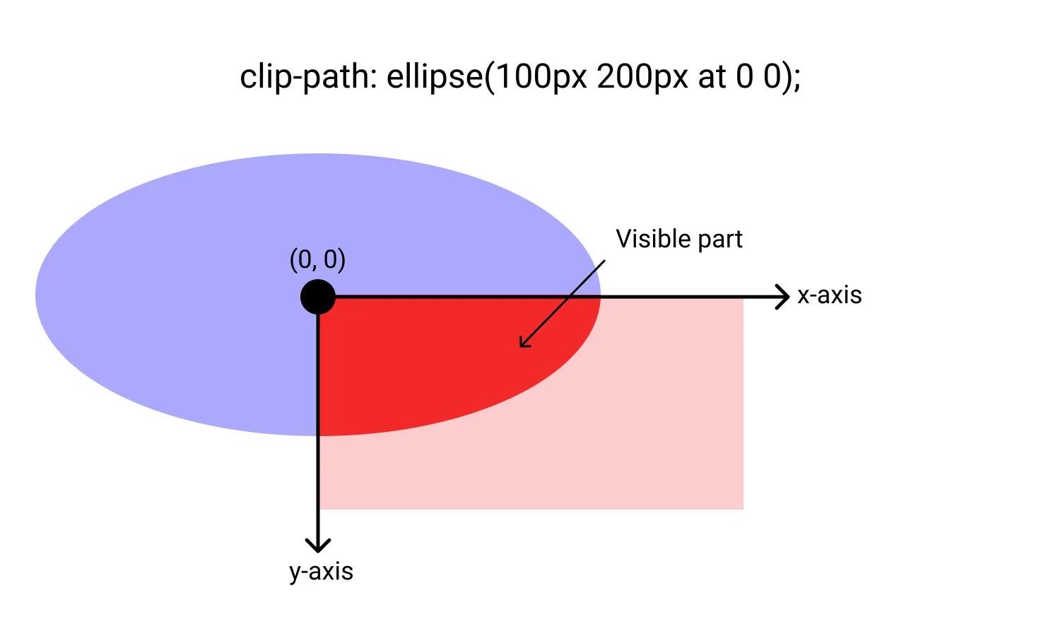
ellipse()
It’s also possible to make ellipse thanks to ellipse(). You have to define x-radius and y-radius, and can also set the position of the center. The syntax is:
clip-path: ellipse(100px 50px at 0 0);
If you want the ellipse to take all the element area, you have access to two specific values to make it easier:
closest-side: Take the size from the center to the closest border.farthest-side: Take the size from the center to the farthest border.
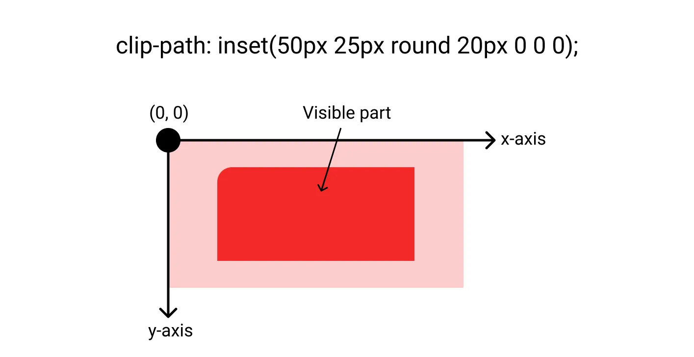
inset()
Another possibility is to define an inset rectangle with inset(). You can define offsets from side of the element (same format than margin) and rounded corner using the round keyword (same format than border-radius).
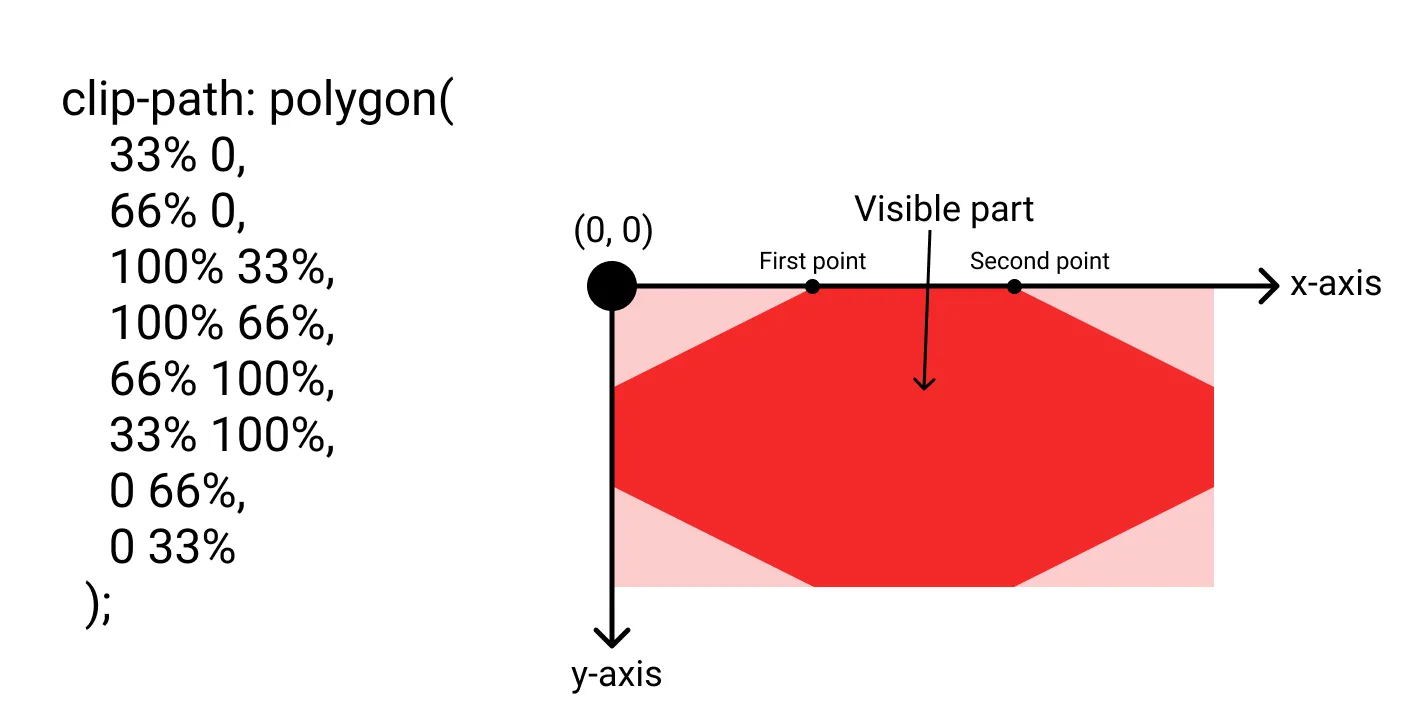
polygon()
The polygon() enables us to define a list of vertices to create shape. The syntax is:
clip-path: polygon(
  33% 0,
  66% 0,
  100% 33%,
  100% 66%,
  66% 100%,
  33% 100%,
  0 66%,
  0 33%
);
path()
You can also define a shape with SVG path with the path() value.
I’m not going to explain how to build an SVG path, because not gonna lie, I just learned how to draw some curves this morning to make the example ^^
But I think I’m gonna try hard this because we can do some crazy things with SVG and animation.
Here is an example:
clip-path: path(
  'M 50 175 L 0 100 Q 25 50 50 100 Q 75 50 100 100'
);
And with the full css we can get:
#heart {
  width: 100px;
  height: 200px;
  background-color: red;
  clip-path: path(
    'M 50 175 L 0 100 Q 25 50 50 100 Q 75 50 100 100'
  );
}

<svg
  width="0"
  height="0"
  xmlns="http://www.w3.org/2000/svg"
>
  <defs>
    <clipPath id="svgHeart">
      <path
        d="M 50 175 L 0 100 Q 25 50 50 100 Q 75 50 100 100"
        stroke="black"
        fill="red"
      />
    </clipPath>
  </defs>
</svg>

<div id="heart"></div>
#heart {
  width: 100px;
  height: 200px;
  background-color: red;
  clip-path: url(#svgHeart);
}
Some examples
Now that you know the theory let’s see some examples of what you can do with it.
Christmas tree
Christmas is coming soon, so let’s make a Christmas tree to put your presents under it.
Transition
Here is an example of what you can do when combining with an animation.
Conclusion
So I hope you liked this CSS article about clip-path and see the power that it can give you.
I decided not to talk about the <geometry-box> feature which can give you the possibility to defines the reference box for the shapes (by default border-box). Because, for the moment, just Firefox manages this new feature.
Thanks for reading
You can find me on Twitter if you want to comment this post or just contact me. Feel free to buy me a coffee if you like the content and encourage me.